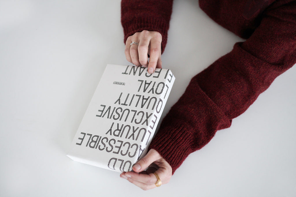
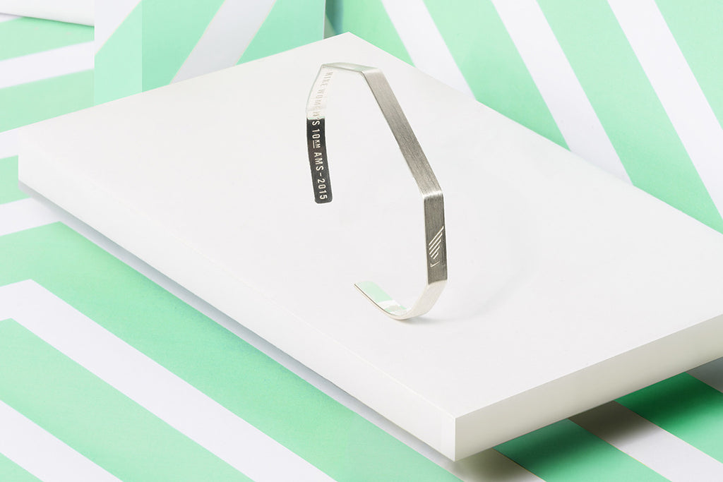
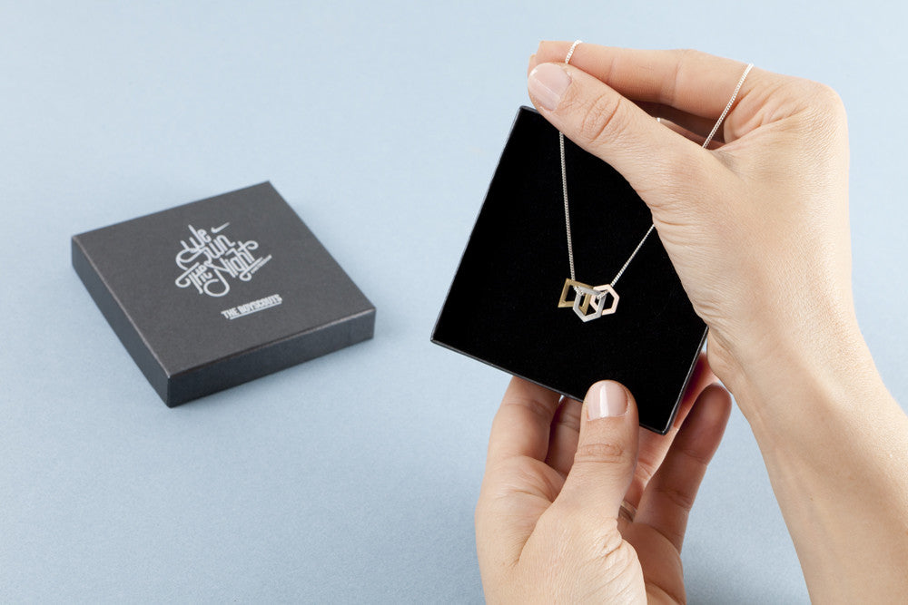
Catarina Mira x The Boyscouts


A collaboration with blogger Catarina Mira, highlighting our Trail Loop earring.
Catarina: "I've started blogging because I felt the need to create something for myself. The purpose of the blog is to inspire others, share happy moments and have a space where I can display all my skills and passions. I first came across The Boyscouts in a shop I love in London called Goodhood. I was drawn to the unconventional designs. There is something very powerful in the simplicity. The great thing about these earrings is that they are a statement piece, they stand out even though they are so minimalistic."